April 23, 2022

All you need to know about the Brand color palette

Filed under: Uncategorized — blogAdmin @ 9:22 am

Are you choosing just the right colors while designing websites?

A renowned Russian painter and a famous art theorist once exclaimed that color is a power which directly influences the soul and we believe that yes, the right shades have the ability to stimulate moods, alter feelings and most tones have a positive impact on our lives.

Has your purchase decision ever been based mainly on the package color?

Do you prefer dishes with an aesthetic color palette?

Does the color theme of a website keep you glued to the screen?

If the answer to these questions is YES, it’s evident that colors can influence your emotions, leading to actions. If you are a website developer or UX/UI designer, you must be well aware of the psychological effect that color can have on your target audience.
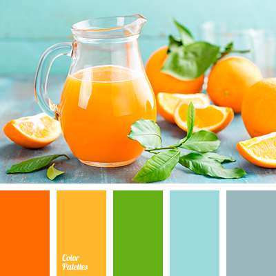
color theme of a website

To make it clearer for all, the effect can be as good as brand strengthening, increased sales or more viewership. Studies have shown that viewers take a subconscious call about the environment or the product within 90 seconds of initial viewing. Infact, between 62 and 90 percent of that assessment is based on color itself.

How customers react to colors

Artists play with just the right color combinations to bring a captivating appeal to their work. Not to mention, the world’s leading brand chains use different tones to surge their purpose and heighten our excitement.

Because the influence goes beyond the visual realm, here’s an overview of what distinguishes each color and you can determine how your brand can choose the right mix.
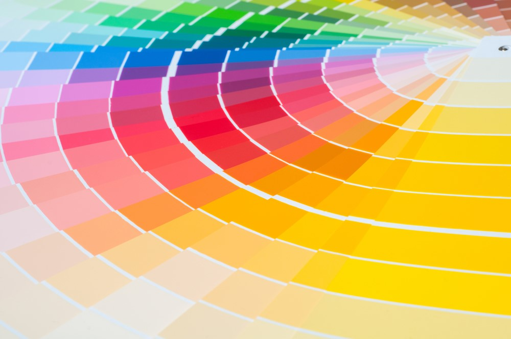
How customers react to colors

Red is all about Power, Passion, Energy, Strength and Excitement

Purple’s mysterious elements are linked with sophistication and royalty.

Green shows good health, freshness, growth and prosperity

Blue is a popular color choice for many brands, which is evident since the color represents trustworthiness and security.

Yellow shadows Optimism, Happiness and Creativity

Orange displays Courage, Confidence, Warmth, Innovation, Friendliness

Black gives a classic appeal blended with elegance, prestige, timelessness, and power.

Grey shows Neutrality, Reliability, Balance, Intelligence

White taps on simplicity, cleanliness, and purity, hence mainly used in health care centers.

Creating a brand color palette

Color combinations can also be used, but it is essential to remember that they can evoke certain feelings through juxtaposition. Let us understand this through an example; the color Blue when paired with Gold, can conjure notions of royalty and luxury, while when used with Pink can tend to feel more playful. Color combinations can mean different things based on cultural and contextual connotations.

Before crafting your brand color:

  1. Check out your competitors’ websites and learn from their color choices.
  2. Analyze how you can differentiate your website.
  3. For more inspiration, explore online color palette generators and find ideas for mesmerizing tones and shades.
  4. Use Dichromatic that is only two primary color schemes if possible.
  5. Complementary colors are pleasant to look at and won’t distract the viewers from your website’s content.
  6. Color shades that are iconic to your brand’s identity and values.
  7. Employ the same color consistently across all platforms to create a unified look and feel for your company that can make it memorable and recognizable.
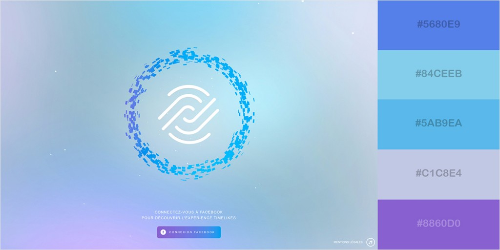
Creating a brand color palette

The color palette you choose for your website must also express the emotions your business and its shared values aim to communicate.

To address this challenge:

  1. Identify your target demographics and study what colors they respond to.
  2. Be aware of the most trending colors in the market at present and take them into account.
  3. Examine and decide what type of emotion you wish to elicit in your audience when they land on your website.

Choose dominant colors followed by lighter tones since the former offers more visual weight.

Summary

You need not be an accomplished artist to finalize your website color scheme. Still, you will need the right people to help you understand the psychology behind the colors, emotions they conjure up, your target audience, their preferences and how you want them to feel when they land on your website.

Along with a bit of expertise, innovation, and knowledge, your modern, trendy and unique website is all set to soar high in the web world!

Choose one of the Best UI/UX Websites Designing Companies in Lucknow to transform your vision into an impactful and impressive website that you can be proud of!

Comments (0)

April 12, 2022

Most Popular Web Development Trends of 2022

Filed under: Uncategorized — blogAdmin @ 9:37 am

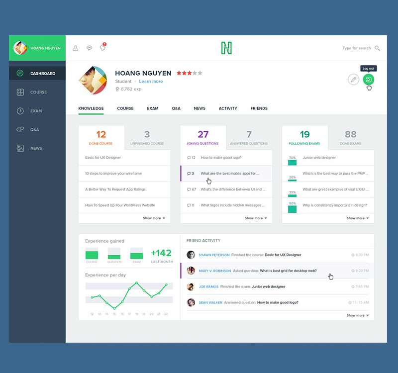
Latest UI Trends for 2022

The key of website design is to look to the future. UX design is an interesting topic that includes creating new things, applications, web designing, and graphical interfaces well as keeping up with technological innovations. Technology evolves at a rapid pace, and web design trends are no exception.

In recent years, designers and Web Design companies that were once revolutionary are becoming outdated, and repetitive. The worst thing you want to happen when visitors arrive at your site and reject it because it is outdated or lacks to adhere to the latest web standards.

Our prestigious web design team stays on top of all the newest website design and development trends in order to design highly functional, user-friendly websites that operate well and look amazing. Let’s take a look at some of the most important website design trends for 2022 in India.

1.     Mechanics of Split-Screen

Split-screen layouts are ideal for minimalist website designs that aren’t overburdened with bold components. Furthermore, it would be an excellent alternative for landing pages with side-by-side options. The trend from a few years ago was useful for usability and responsiveness at the time, but it’s now more of a design.

Screens that are divided horizontally or vertically with the same or distinct functional or click actions on either side are examples of these graphics. They offer a strong visual experience as well as various menus and tabs to access information.

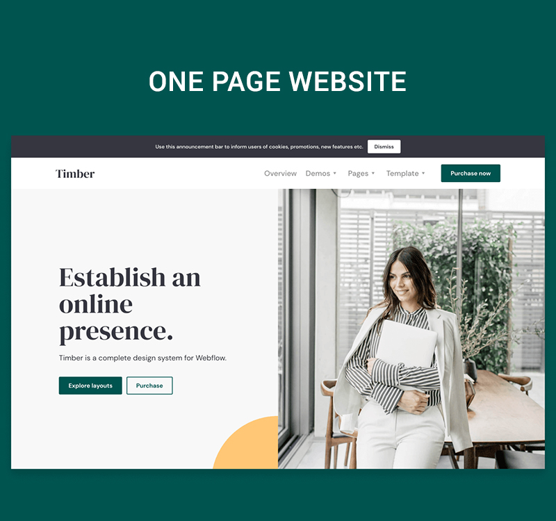
2.     One page Website

A one page website is one which has one HTML page. There are no extra pages like an about us page, Services, or Contact Us page.  We’ve noticed an increase in the popularity of one-page websites, which do away with menus and navigation in favor of easy scrolling. When the topic matter is shorter, such as a portfolio or the presentation of a single idea, one-page sites perform well.

One-page websites push designers to reconsider their whole strategy and structure in order to not only put all of their information in the center but also to determine what is most crucial to showcase in the first place. These sites operate best when the topic matter is narrower, such as a portfolio, but they can also serve as a helpful bridge to bring visitors where they need to go faster and more efficiently without the need for unnecessary searching.

One page Website

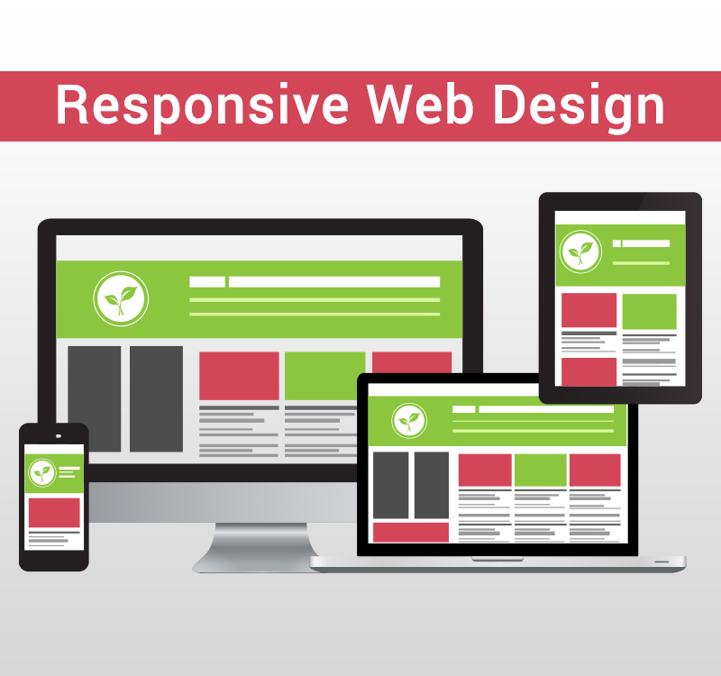
3.     Responsive Web Design

It’s no longer enough to have a static website design that merely looks excellent on a computer screen, especially as the internet is increasingly accessed via mobile devices. When designing a website, you must take into account tablets, computers, and various smartphone models with various screen sizes.

You can ensure that your website appears great on cell phones, tablets, laptops, and desktops by using responsive web design. A better user experience with responsive web design implies more conversions and increased revenue.

Responsive Web Design

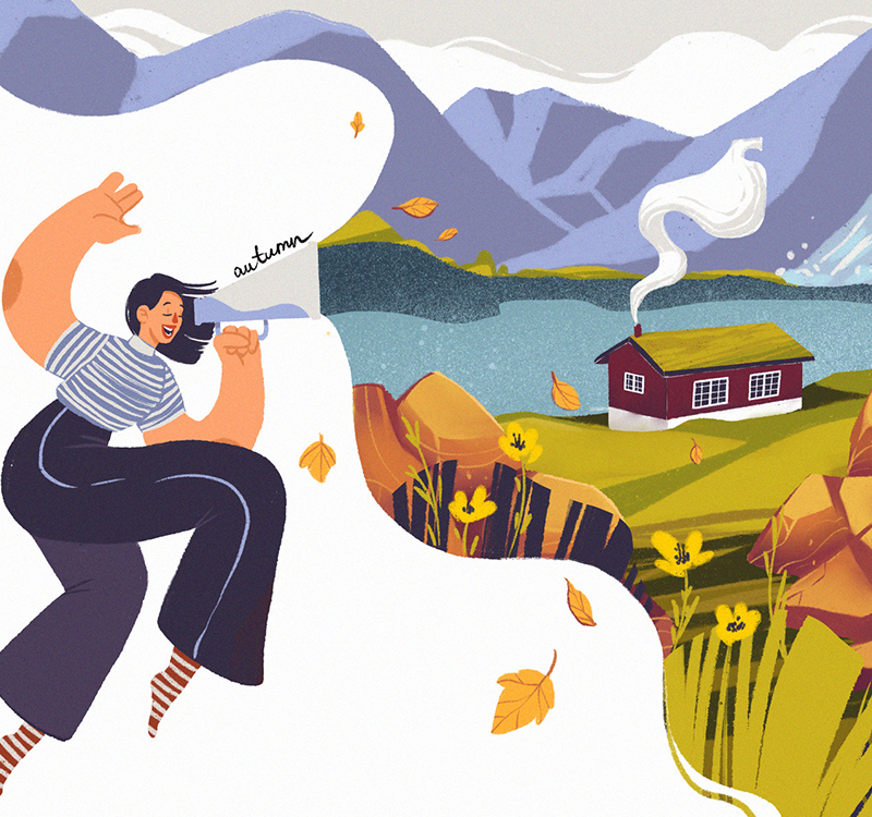
4.     Custom Graphic Designs & Illustrations

When compared to stock photos, the visual effect of a custom artwork has a greater impact on visitors. An illustration with vivid colors says a lot and is more engaging than merely an image. Because of the above-mentioned issue, companies are now striving to incorporate modern graphics into their websites in order to make their online presence more fascinating and engaging.

Do you want to set your website out from the competition? The best method to do it is to use customized designs with images and sketches. We provide the latest software development with unique web design services; visit our Web development company to seek help now.

Custom Graphic Designs & Illustrations

5.     Minimalism or flat design

Flat design, often known as minimalism, is not a new trend, but it is predicted to last for quite some time. Flat design is often connected with a lot of white space, but minimalism does not have to be synonymous with white in 2022. According to IT experts, there will be a lot of colorful minimalist experimentation.

You can follow this trend by creating a website with a bright background color, few design elements, and clean typography to produce a visually appealing and user-friendly website. Simply put, minimalism does not have to be monotonous, and you can experiment with color.

Conclusion

Some of the topics that we discussed in this blog may be known to you, but others may be new to you.  Before you choose a trend to implement, keep in mind the primary goal of your website which is to assist people in achieving their objectives by creating effective websites.

Before implementing a trend, you should examine the benefits and drawbacks. Choose the one that provides a more enjoyable and engaging user experience. Our web design and development team came up with a visually appealing and effective design that integrates many of the most recent web design trends.

Comments (0)